
Karl’s
Custom Typography
Merchandise
Website
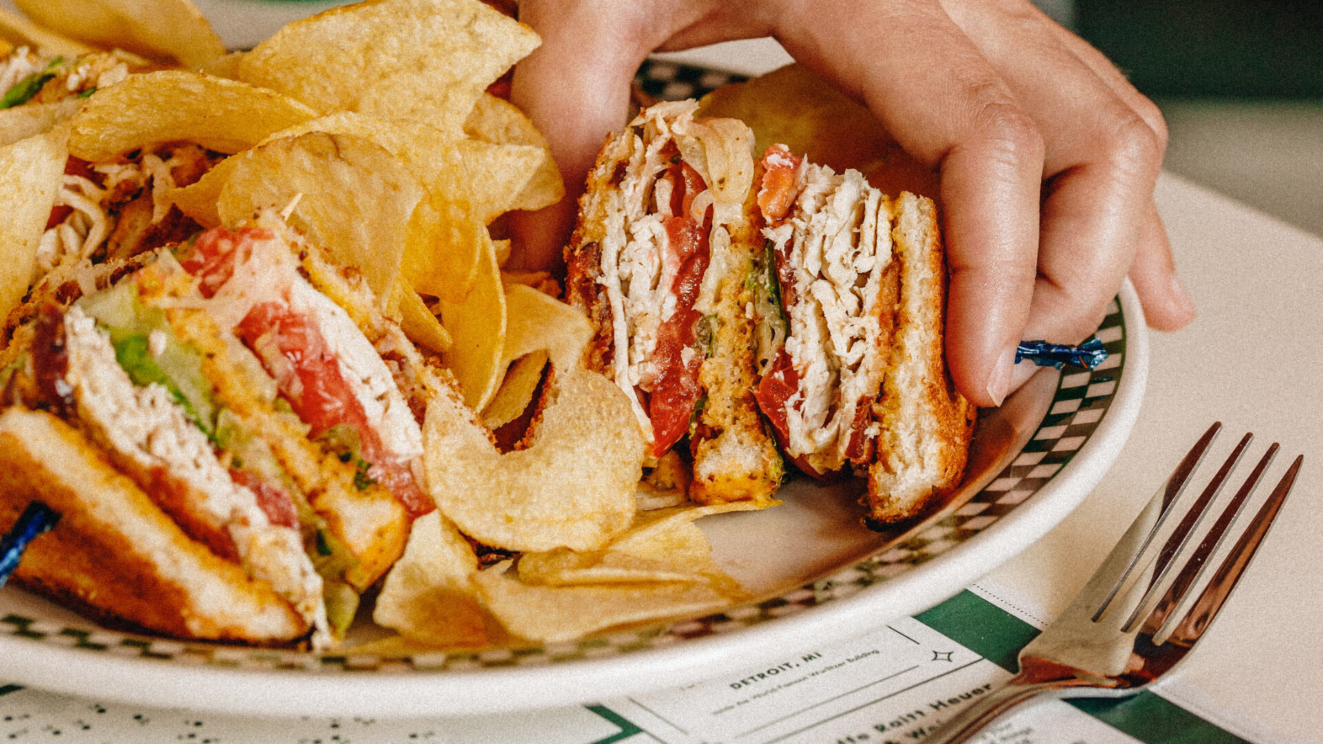
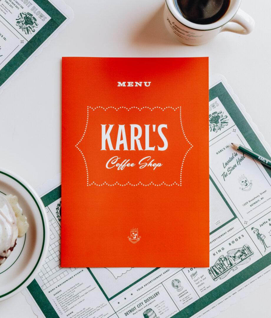
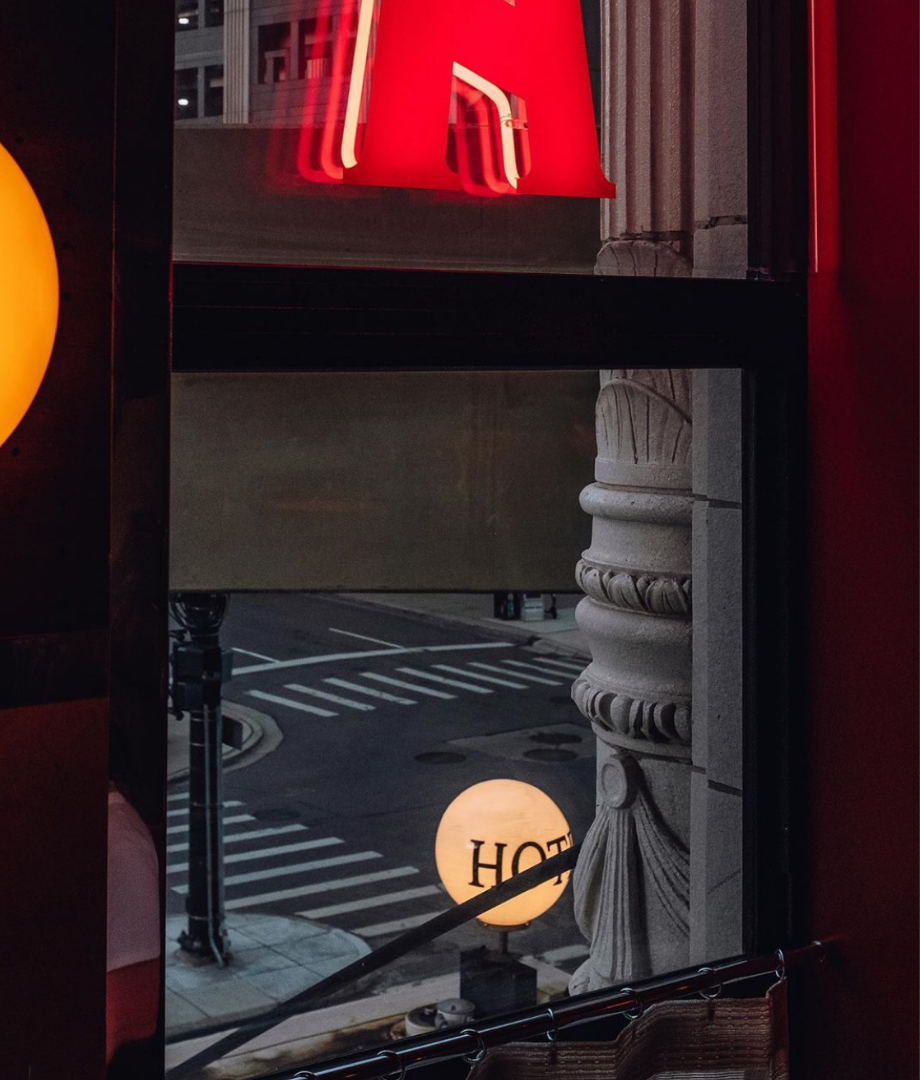
Inspired by her great-great-grandfather’s bakery, Chef Kate Williams wanted to design a gourmet diner that felt as though it had been family-owned and operated for generations. Our team scoured the archives for hundreds of vintage restaurant graphic styles before designing Karl’s wholly unique look and feel. In partnership with the team from ASH NYC – who designed the interiors – we created a comprehensive brand system, including everything from the neon typography in the windows to the placemat with real Detroit businesses. We even wrote and included a crossword puzzle. Karl’s has quickly become one of the most notable new arrivals in the Detroit restaurant scene, with Bon Appetit saying that “every detail celebrates the history of the city and the people who lived there.” It’s also our favorite place for a ham sandwich.
Award - Graphis Design Annual 2021